What is the Colour of the Year?
Every year, experts at the Pantone Colour Institute™ comb the world looking at leading colours in fashion, entertainment, travel destinations, social media platforms, and worldwide sporting events. An influential colour is then selected and defined as their ‘Colour of the Year’. For over two decades, this concept has been shaping fashion, interior trends, home furnishings and industrial design.
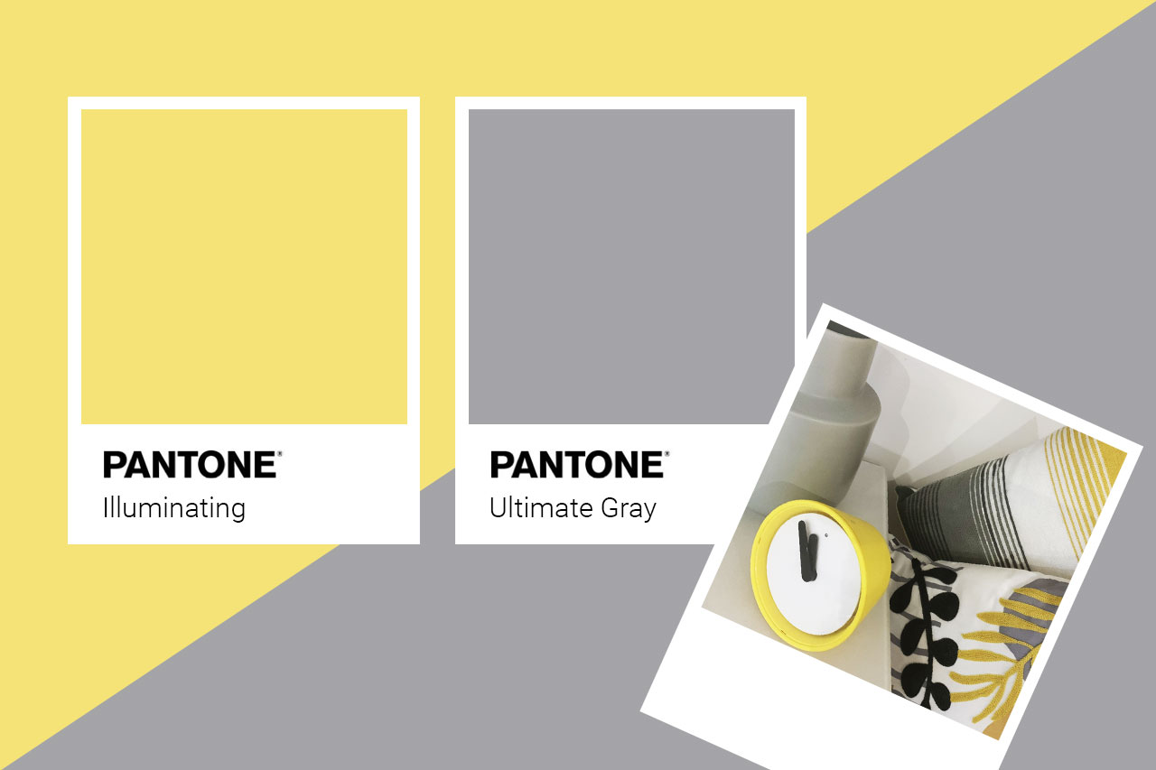
In 2021, they have defied convention somewhat and selected not one, but two colours: ‘Ultimate Grey’ and a beautiful, sunny yellow called ‘Illuminating’. We absolutely adore this marriage of colour! Grey is a lovely, calming neutral, and we love the uplifting effect of the vibrant yellow. And, it just so happens that the Pier Creative studio is decked out in these very colours. How on-trend are we? (well, this year anyway!)
Why is colour so important?
A huge part of brand recognition is through the use of colour. Did you know that using a signature colour can increase a consumer’s recognition of a brand by 80%? It’s not surprising when you think about it. Take Coca Cola with its iconic red, the bold and uplifting blue and yellow of Ikea, or the playful primary colours of Google. As soon as you see these unmistakable hues, you can quickly identify the giants that they belong to. Clever stuff, hey?!

Using colour in your branding
You don’t have to have a branding budget as big as these massive corporations to get noticed. Here are a few examples of how colours are typically used and the feelings they evoke.
- Red. A colour preferred by the automotive industry. Red is suggestive of speed and excitement!
- Blue. Popular with tech companies, blue exudes dependability but also serenity.
- Pink. Historically, pink was linked to red, which was seen as strong and masculine. In contrast, blue was associated with the Virgin Mary, hence its more feminine connotations. In the wake of WWII, the tables were flipped, and now pink is associated with femininity.
- Green. Reflecting the earth, green is synonymous with the environment, health and wellbeing.
- Black. By far, the most popular choice for luxury brands! Think boutique hotels, wellness spas, and top-end health and beauty products.
- Yellow. The colour of happiness! It’s great for standing out amongst competitors on retail shelves. It is also associated with original thought because it resonates with the logical left side of the brain. Maybe that’s why we were so drawn to it for our own branding?!


